Calculations are written in Python with a significant emphasis on Pandas use. The application itself was developed using a Flask framework. A Bootstrap template is used for the navigation bar and certain button / form styles. WTforms is used to handle forms. Most of the HTML, CSS & Javascript design/implementation on the Home, Analytics, Technical Notes, and About pages are my own. SQL Alchemy is used as an ORM (Object Relational Mapper) for "database" access. Portfolio charts are rendered using Chart JS.
Server configuration details:
- Virtual Private Server provider: Linode
- CPUs: 2 (shared); RAM: 4GB
- Operating System: Ubuntu 21.10
- Web server: NGINX
- Server region: Dallas, TX
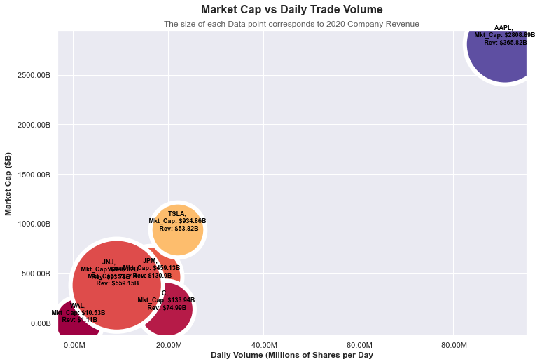
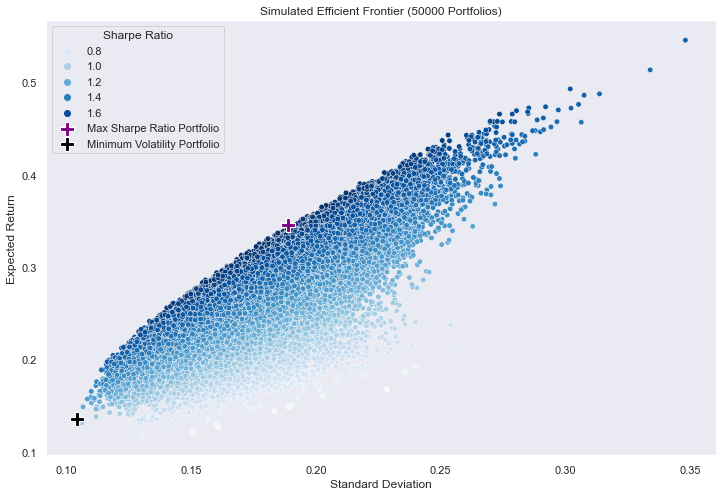
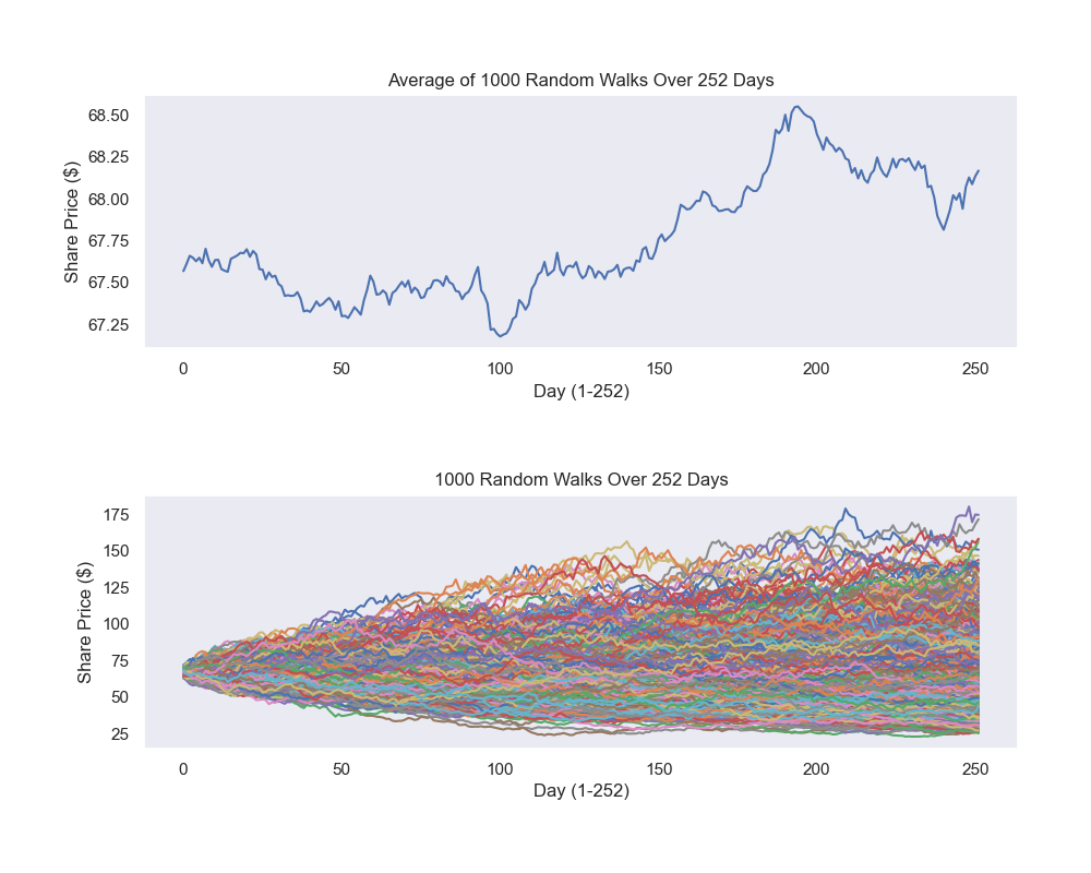
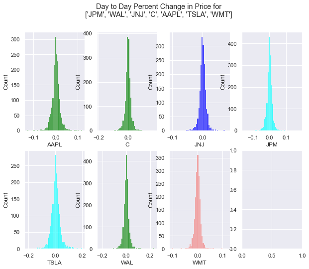
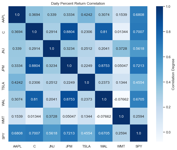
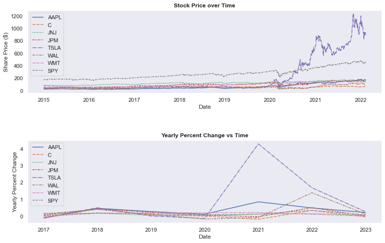
Charts below are the initial versions rendered using MatPlotLib and Seaborn:
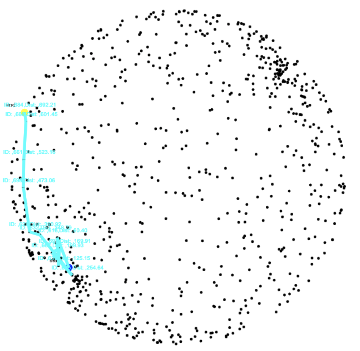
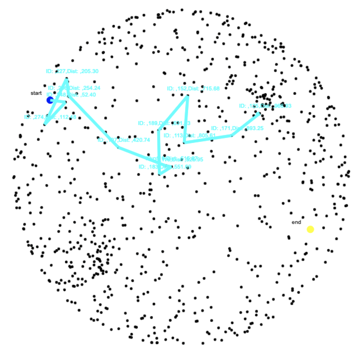
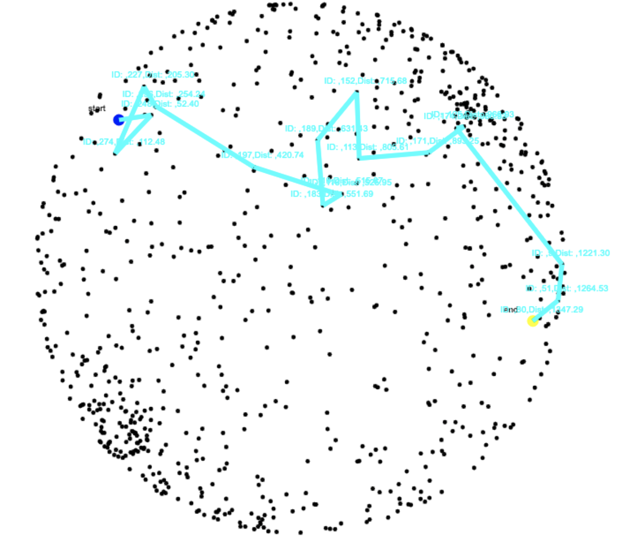
Images below show optimal searching along a sphere. I ultimately decided not to display this on the website:
Below are links to helpful resources I used/ referenced to build the website!
Portfolio Optimization:
The portfolio optimization module is an interactive web application designed to assist with basic portfolio allocation. The website utilizes two methods to approach the question of how to best allocate weights with the aim of constructing the "optimal" portfolio.
- Monte-Carlo (Random) simulation wherein n-thousand portfolios are generated and the portfolio with the maximum sharpe ratio is selected.
- Maximizing the Sharpe Ratio using Sequential Least Squares Programming (SLSQP) via Scikit.Optimize.minimize.
Every portfolio entered is stored in a database. The number of the portfolio, the stocks entered, and the start date used are all logged.
While there is the ability to create an account, login/logout, reset your password etc. there is no benefit in creating one. Usernames/emails are stored and can be referenced but these features were only added to learn more on how to actually do it. As such I will remove these features sometime in the future.
Features that were omitted from the current version include:
- The ability for the user to manually enter weights and compare their inputs to the optimal weights
- The ability to create an account and add past portfolios to your account
- Comparing two separate portfolios on the same page
- Individual asset linear regression analysis using Sklearn
- Charts showing the 30day average, a correlation heat map, and an overlapping percent return histogram
- Random walk simulations and visualizations
Initially all charts were rendered using MatPlotLib and Seaborn. All charts on the Analytics page are rendered using Chart JS. For the sake of time, not all charts and features initially written in python were implemented in the the website you see here today.
Math:
- Basic Concepts / Math behind portfolio theory (PDF): http://www.its.caltech.edu/~rosentha/courses/BEM103/Readings/JWCh07.pdf
- Derivation of Variance / Covariance - Wellesley Quantitative Analysis Institute (Video) https://www.youtube.com/watch?v=ZSwjaIUPBRg
- Least Squares - MIT (Video) https://www.youtube.com/watch?v=YwZYSTQs-Hk
- Maximizing the Sharpe Ratio / Standard Qaudratic Program (PDF) https://people.stat.sc.edu/sshen/events/backtesting/reference/maximizing%20the%20sharpe%20ratio.pdf
- Sequential Quadratic Programming (PDF): https://www.math.uh.edu/~rohop/fall_06/Chapter4.pdf
- Scipy.optimize docs: https://docs.scipy.org/doc/scipy/tutorial/optimize.html
- Introduction to Probability 2nd edition (Bertsekas, Tsitsiklis): https://www.amazon.com/Introduction-Probability-2nd-Dimitri-Bertsekas/dp/188652923X
Programming:
- Scipy.optimize docs: https://docs.scipy.org/doc/scipy/tutorial/optimize.html
- The Flask tutorial I used for the base of the project (Corey Schafer): https://www.youtube.com/watch?v=MwZwr5Tvyxo&list=PL-osiE80TeTs4UjLw5MM6OjgkjFeUxCYH
- Code for generating basket of portfolios / the Efficient Frontier (Ricky Kim): https://towardsdatascience.com/efficient-frontier-portfolio-optimisation-in-python-e7844051e7f
- Markowitz’s Efficient Frontier in Python [Part 1/2] (Bernard Brenyah): https://medium.com/python-data/effient-frontier-in-python-34b0c3043314
- Markowitz’s Efficient Frontier in Python [Part 2/2] (Bernard Brenyah): https://medium.com/python-data/efficient-frontier-portfolio-optimization-with-python-part-2-2-2fe23413ad94
- HTML5 Canvas Tutorials for Beginners (Chris Courses): https://www.youtube.com/watch?v=VNmTubIDZOY&list=PLpPnRKq7eNW3We9VdCfx9fprhqXHwTPXL&index=10
Electrostatic Potential / Static Fields:
Math & Physics:
- Thomas Calculus 13th Edition Early Transcendentals (Thomas, Weir, Hass, Heil): https://www.amazon.com/Thomas-Calculus-Early-Transcendentals-14th/dp/0134439023
- The Physics of Energy (Jaffe, Taylor): https://www.amazon.com/Physics-Energy-Robert-L-Jaffe/dp/1107016657
- Electric Field Produced by 2 Point Charges (vector example) (Craig W Looney) https://www.youtube.com/watch?v=47moTe6FVkY
Programming:
- Coding Math (Keith Peters): https://www.youtube.com/user/codingmath/featured
- HTML5 Canvas Tutorials for Beginners (Chris Courses): https://www.youtube.com/watch?v=VNmTubIDZOY&list=PLpPnRKq7eNW3We9VdCfx9fprhqXHwTPXL&index=10
Path Algorithms:
Math & Physics:
- CS 161 Lecture 11 - Stanford (Himanshu Bhandoh (2015), Virginia Williams, and Anthony Kim (2016), G. Valiant (2017), M. Wootters (2017)): https://web.stanford.edu/class/archive/cs/cs161/cs161.1176/Lectures/CS161Lecture11.pdf
- A* Search Algorithm (Wikipedia): https://en.wikipedia.org/wiki/A*_search_algorithm
Programming:
- How to Create a Rotating 3D Cube in JavaScript (Mt. Ford Studios): https://www.youtube.com/watch?v=gx_Sx5FeTAk